Mokabe’s Coffeehouse Rebrand
For this Branding & Identity class project, we each had to pick an existing business that was in need of rebranding. For the duration of the semester, we thoroughly went through the rebranding process including project price estimation and scheduling, research and competitive analysis, mission statement and tagline writing, logo design development and refinement, and brand development and application.
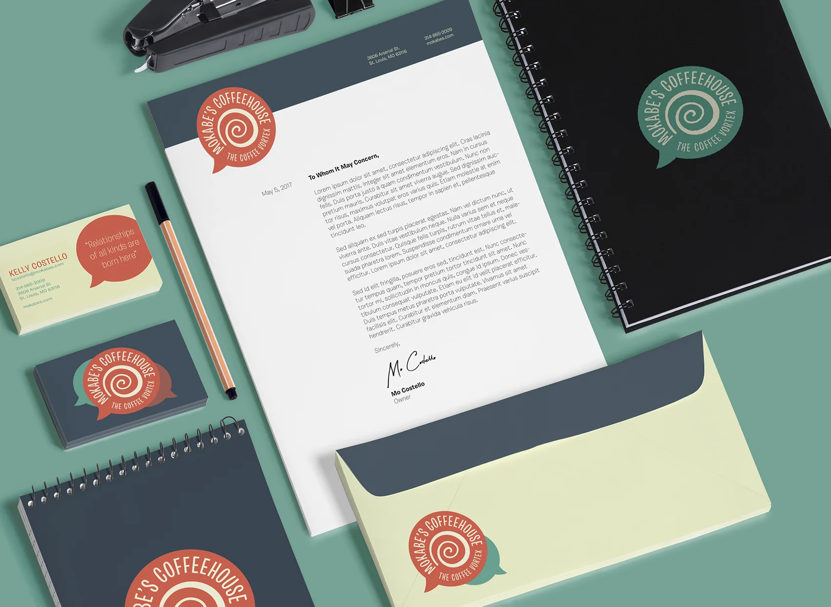
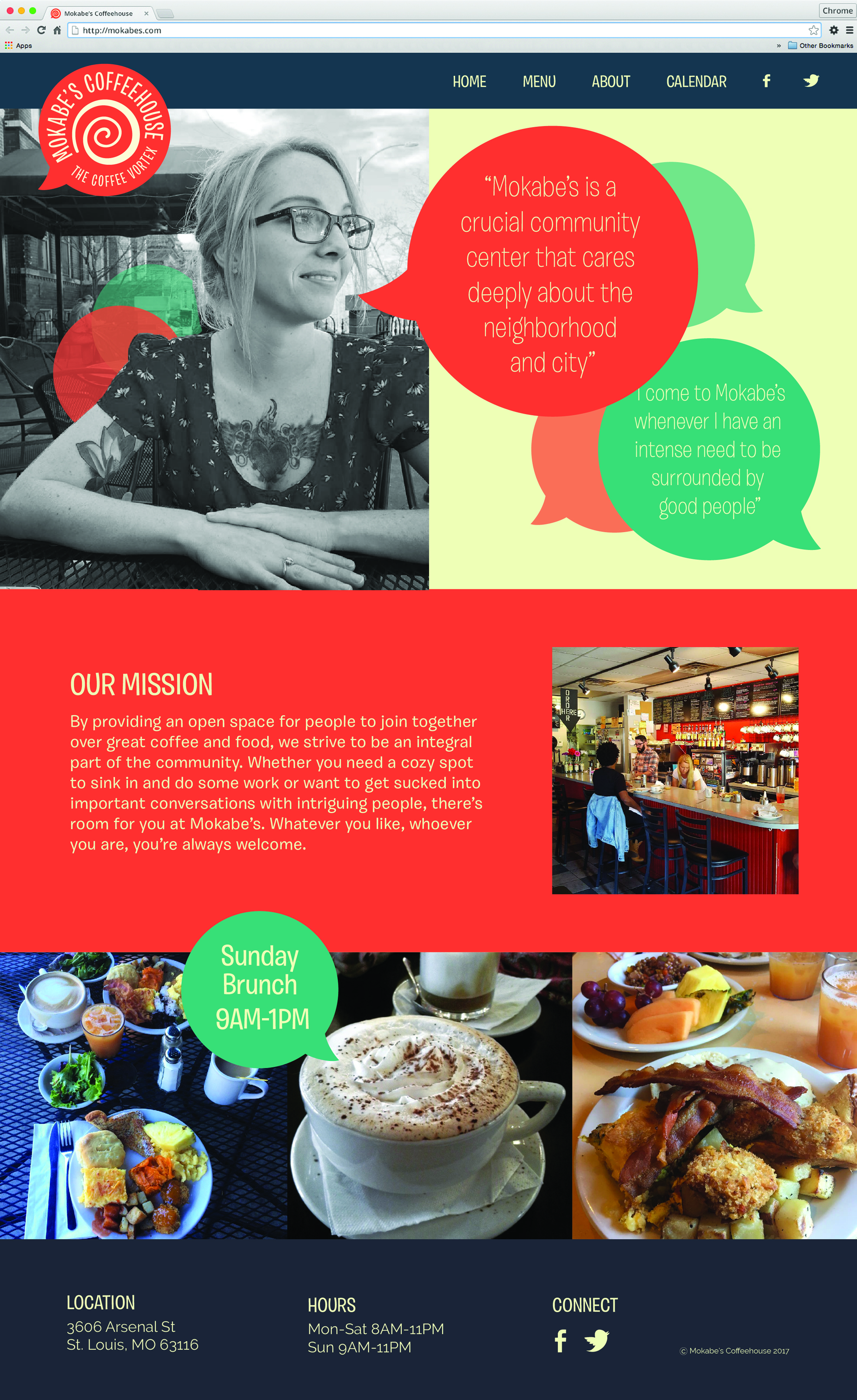
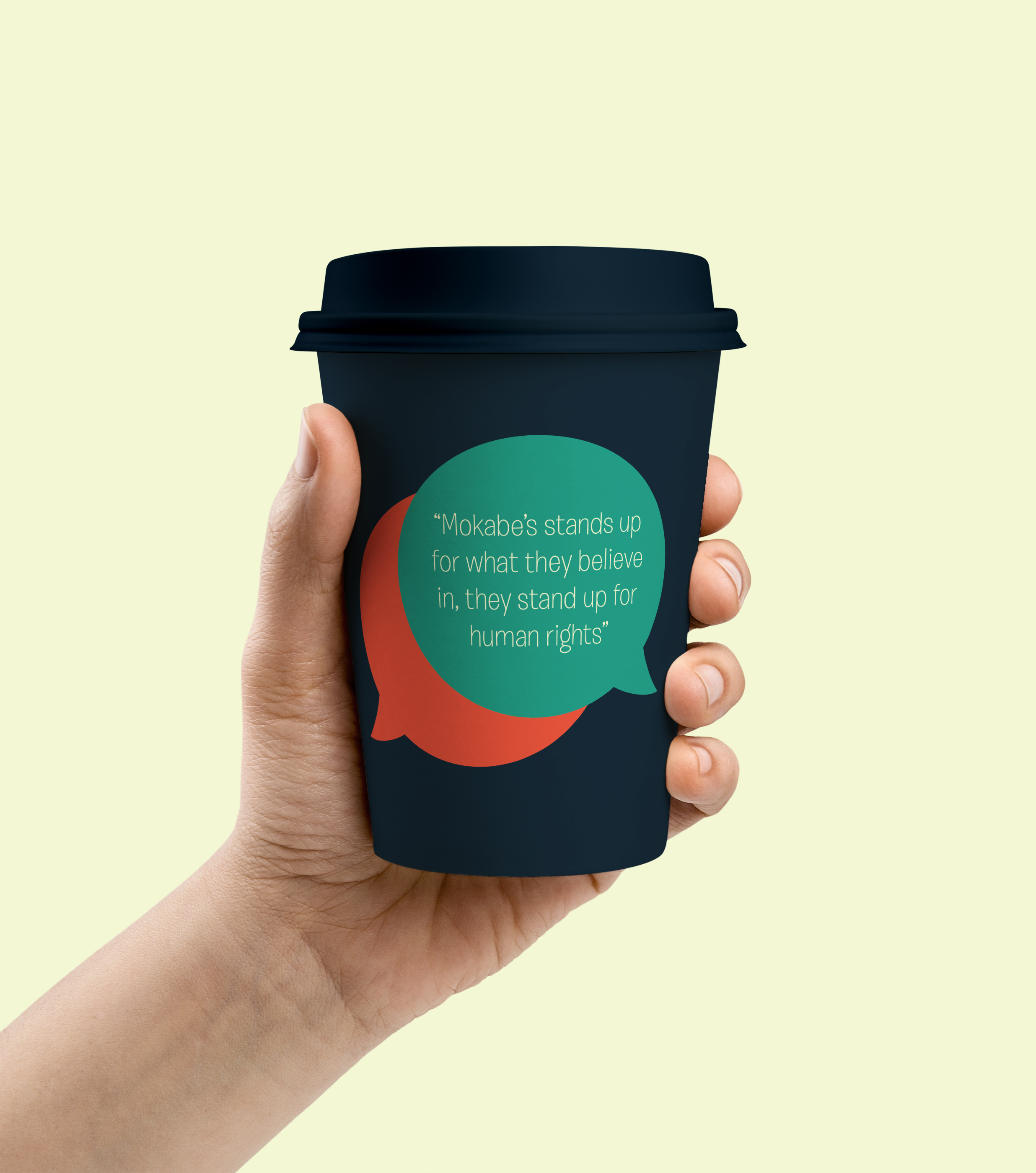
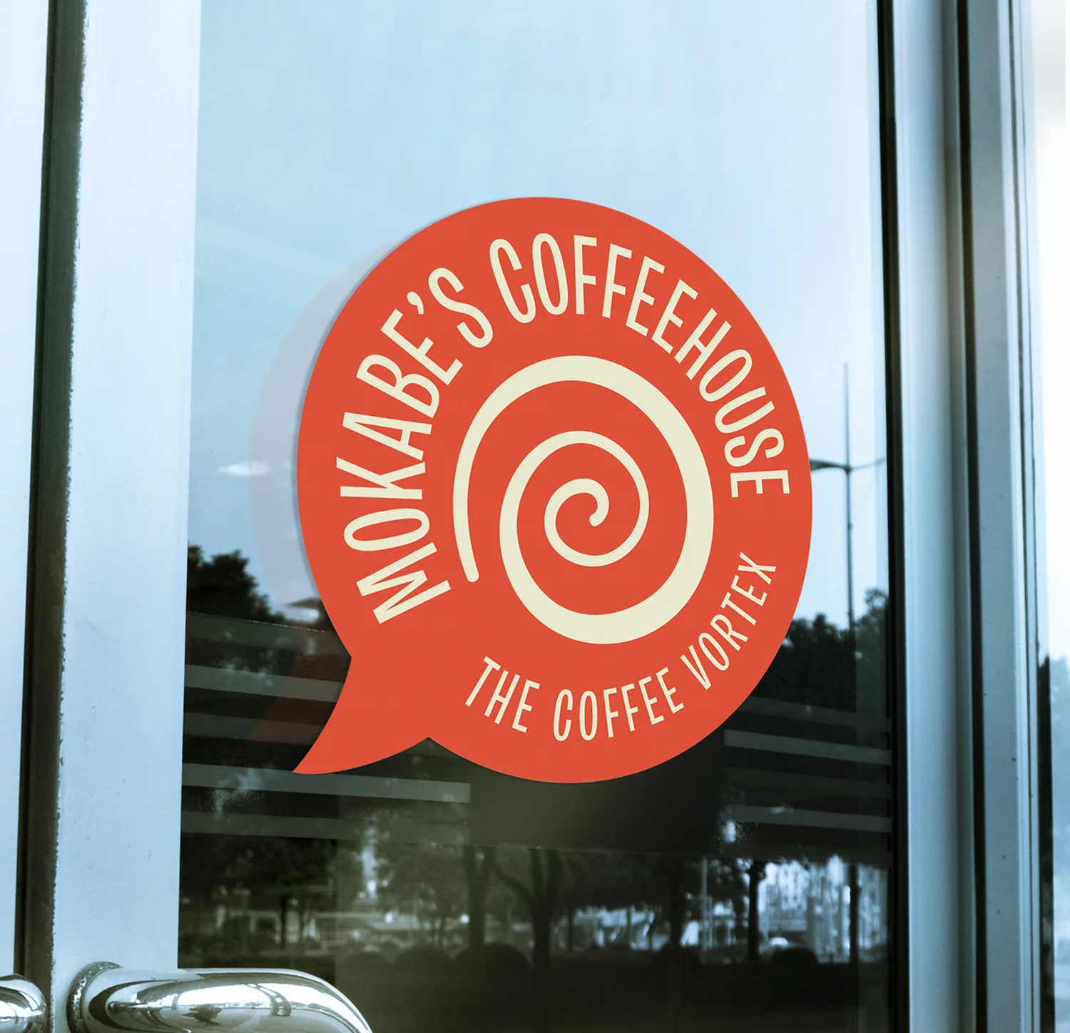
Mokabe’s Coffeehouse is a local St. Louis coffee shop that has been in operation for over 20 years. While they have a really unique atmosphere and a strong, loyal customer base, they currently have no clear branding or identity in any of their marketing. They do not do much in terms of advertising, aside from keeping up with their social media sites like Facebook and Twitter, but even these lack any sense of the identity that their customers know and love them for. The rebranded logo and brand applications reflect how Mokabe's serves as a crucial point in their community where lots of different people can come together. The new tagline "The Coffee Vortex" conveys how Mokabe's has a way of sucking people in, whether that be through conversation or simply through being a space people can relax in for a while. The vibrant colors reflect their energy and passion for being a welcoming space and making change. The brand attributes utilize quotes from customers that speak to their inclusive nature and sum up why people keep coming back.

Process
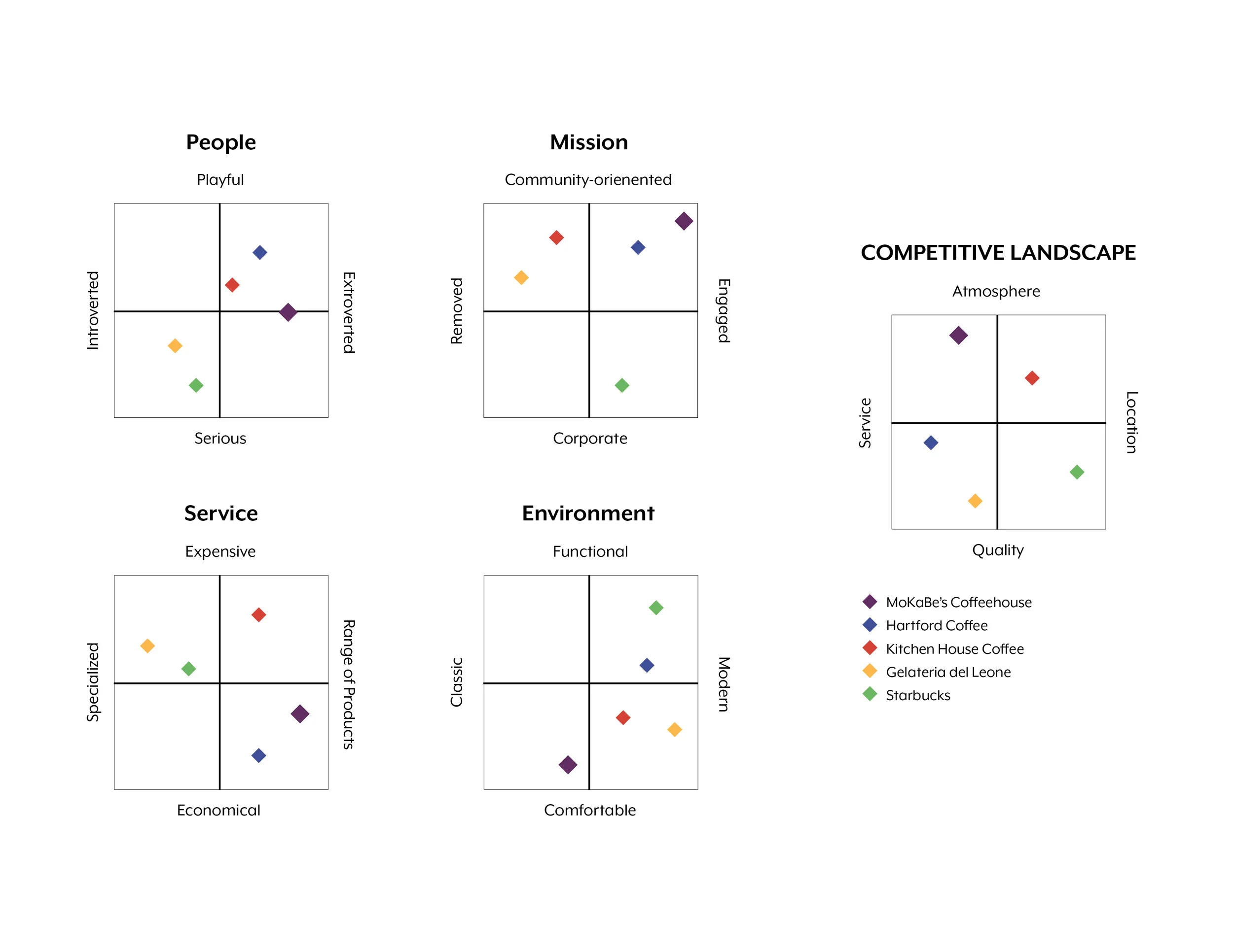
In order to start rebranding, I thoroughly looked at Mokabe's current brand as well as their competition. In a narrow view of their competition, I looked at the coffee shops closest to them, which included three other local businesses as well as a Starbucks. By studying their competition, I was able to observe how Mokabe's stands out from the crowd and differentiates itself. I created a set of positioning charts to better understand where they aligned compared to others for a variety of different attributes. These charts confirmed that the major attributes which make the restaurant stand out are the fact that they are very engaged and their atmosphere. These findings greatly informed the development of the logo as well as the rest of the brand attributes.

Mokabe's current branding at start of project
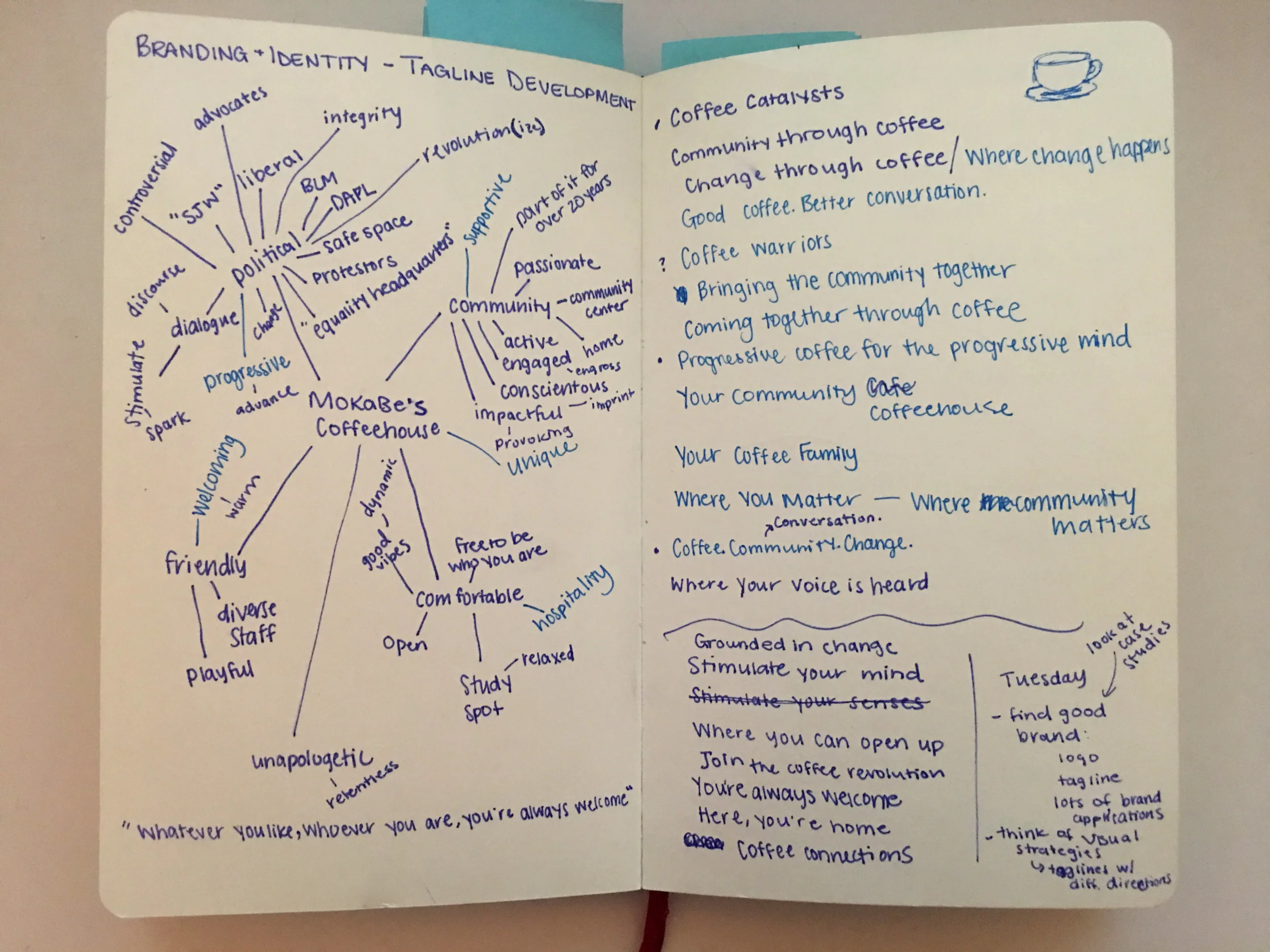
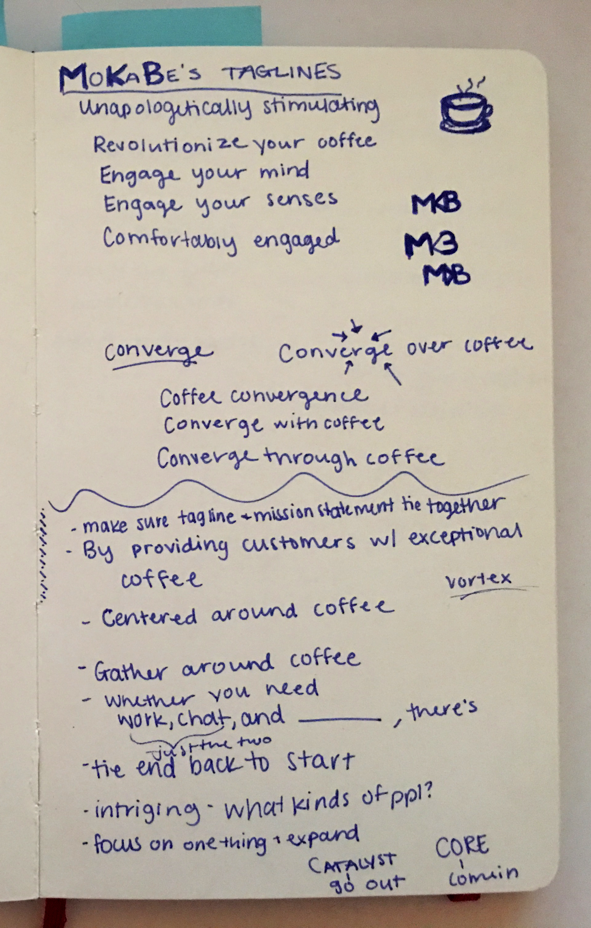
Before beginning logo development, I made a word map of the unique attributes of the restaurant. Mokabe's has a very progressive feel in part because of their decor, which includes Black Lives Matter signs and other political messages, and also because of the safe space they have established for people of all races, sexualities, identities, etc. through hosting various meetings, inclusive messaging, and more. They often act as a place where different people in the community come together. These attributes are what I aimed to convey through my tagline and brand attributes.
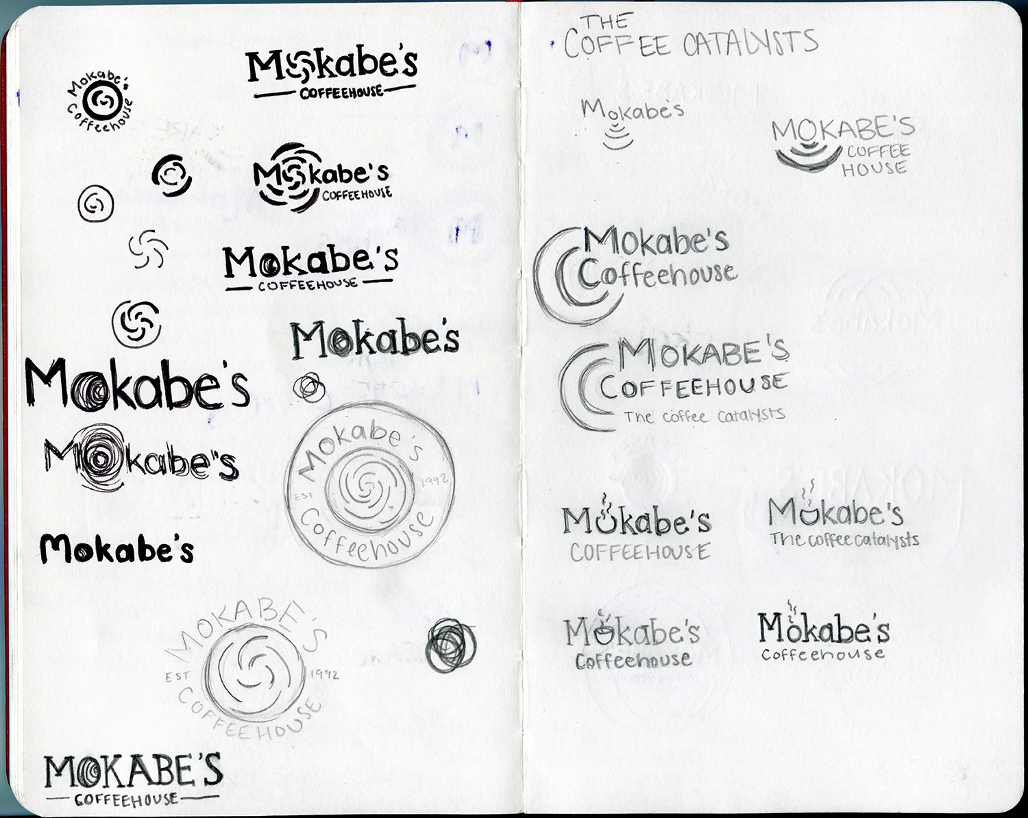


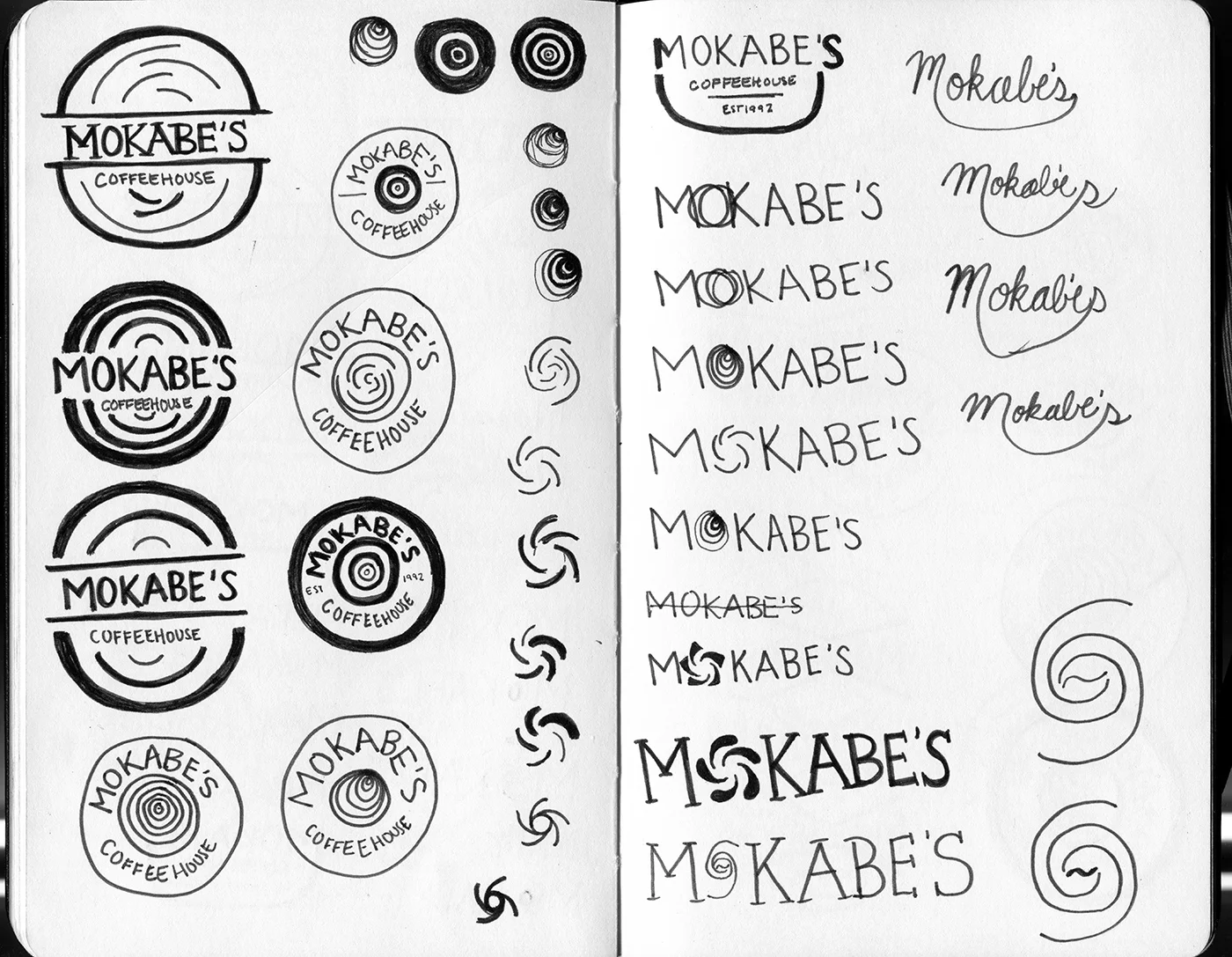
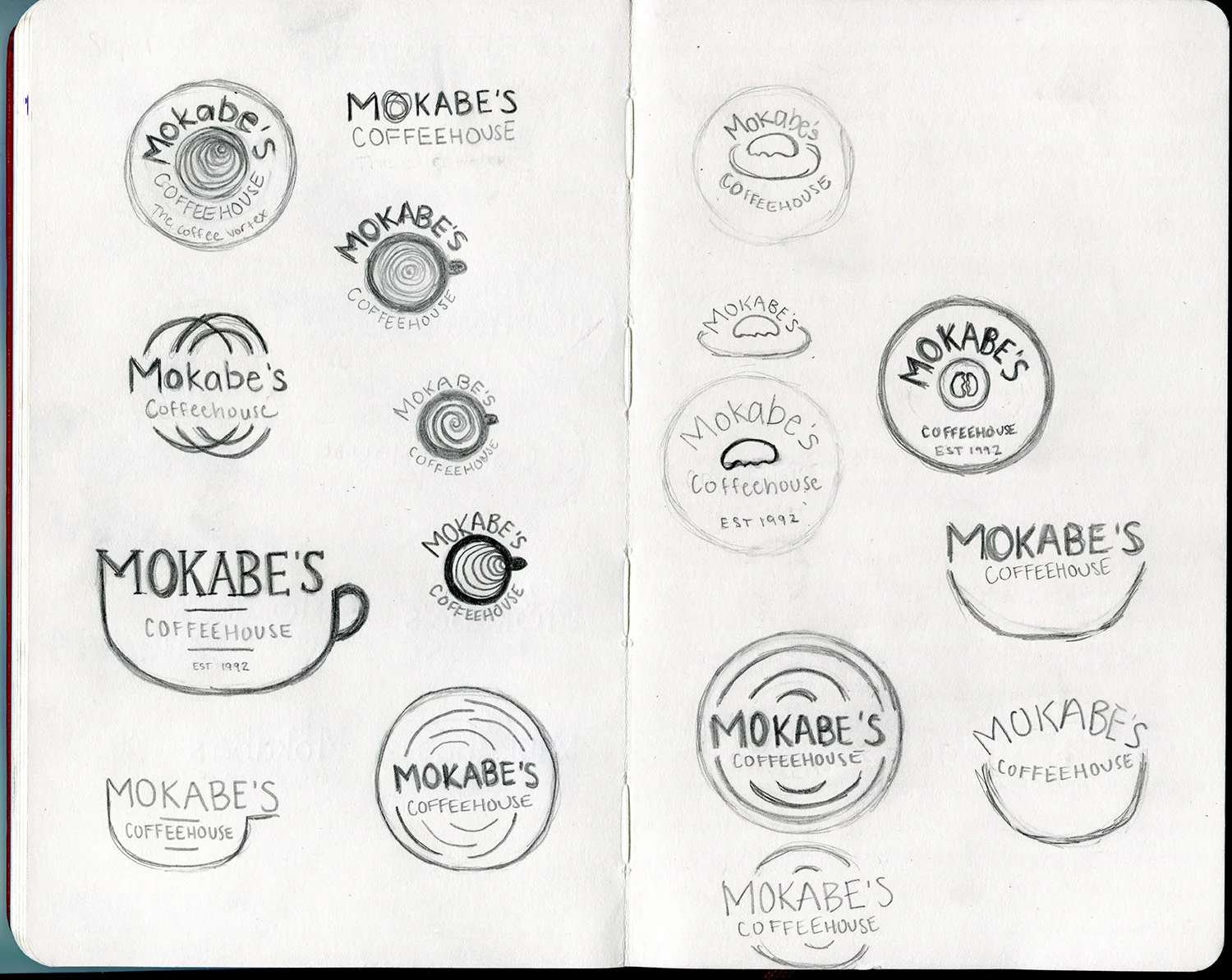
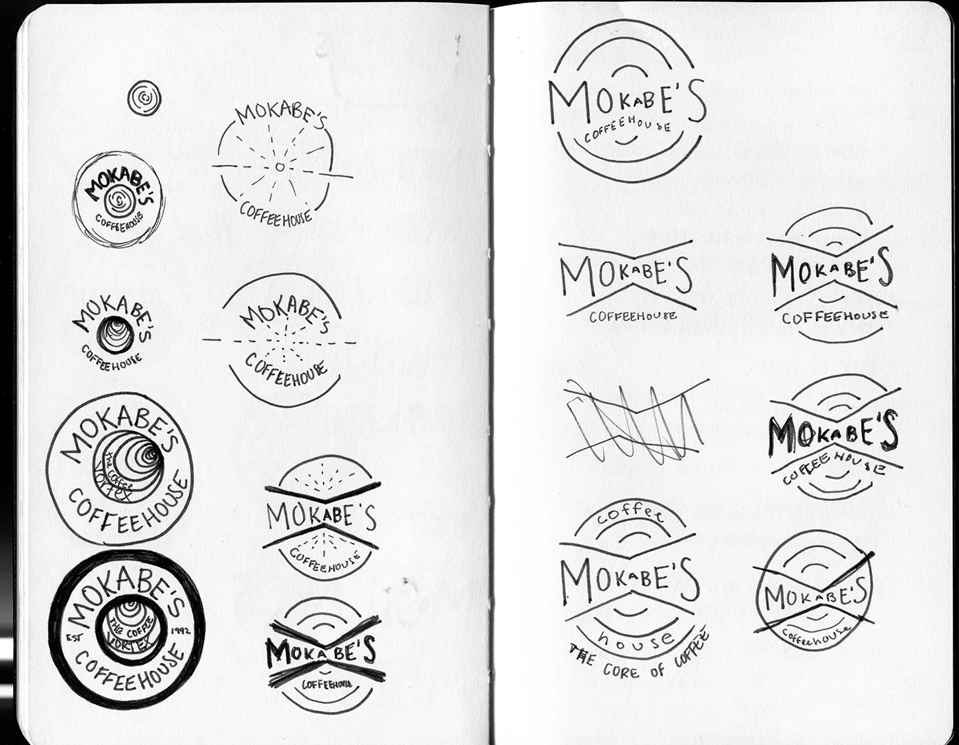
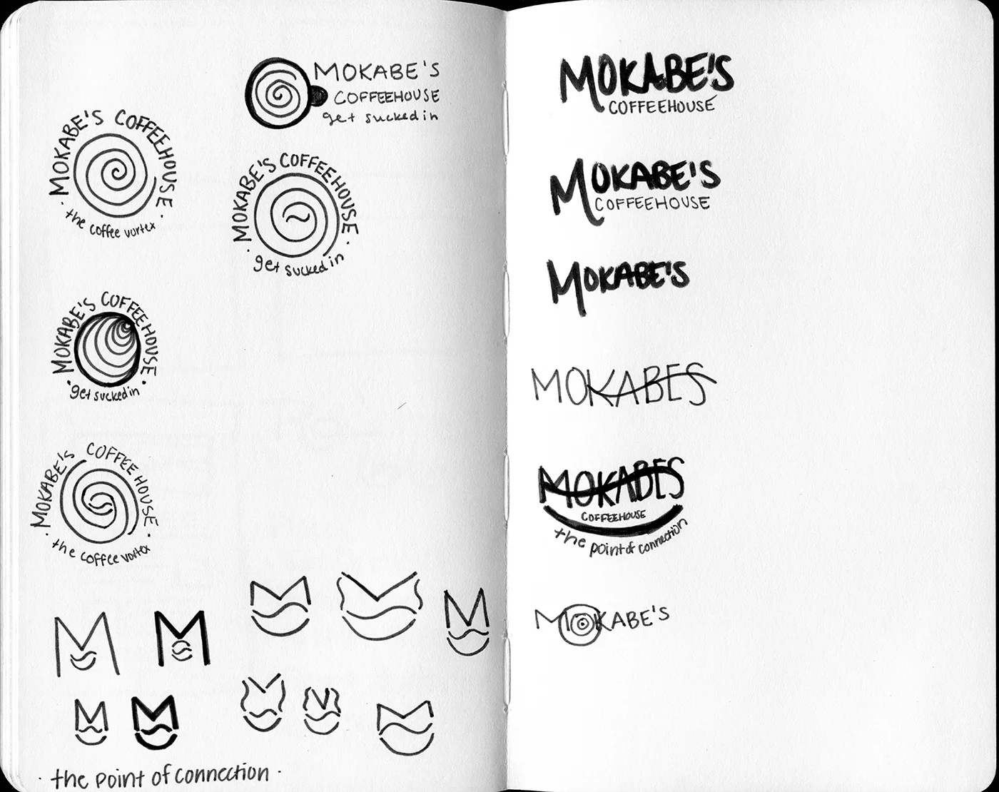
Logo sketches