Linxup Rebrand
Agilis Systems, a telematics SaaS company, originally sold under five additional brand names. A shift in strategy led to consolidating these brands, and Agilis Systems shed its name to go by the flagship brand most customers knew them as: Linxup. With the merging of these brands, the Linxup logo and visual identity needed an update.
Solution
Branding | Print | Digital | Social Media | Presentations | Environmental | Templates
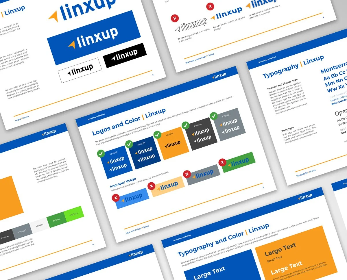
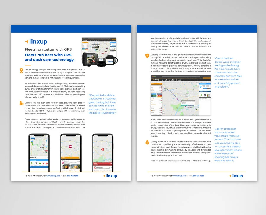
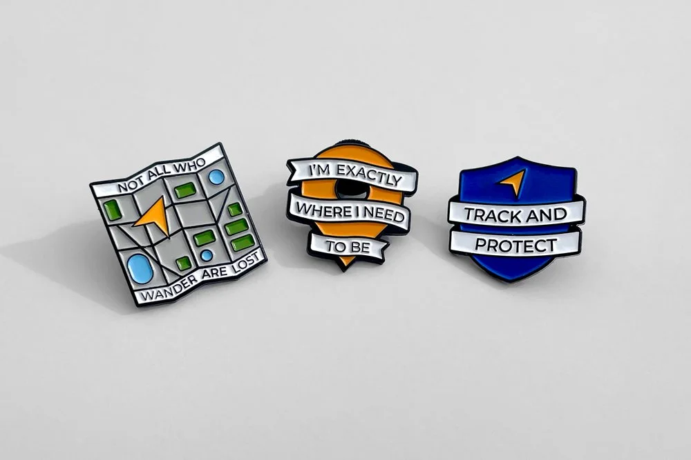
I led the visual rebrand for Linxup from concept to development and execution, creating a new logo, branding guidelines, business cards, onboarding documents, environmental graphics, and more. The new logo brings in the tracker arrow from the Agilis Systems logo and merges it with the Linxup identity. The clean, sharp lines emphasize Linxup’s commitment to “Simplify the Complicated”. An updated, more vibrant color palette illustrates the company’s energy and innovation, standing out more in digital spaces.
Old Logos
New Logo
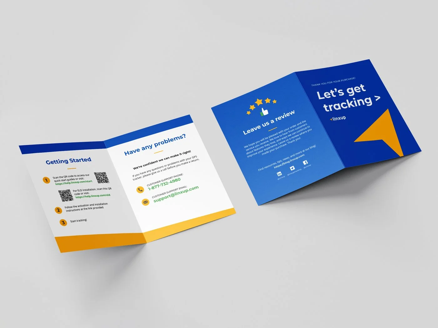
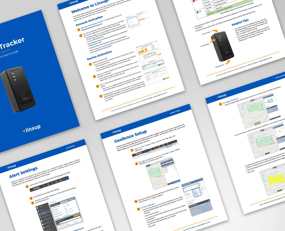
Redesigned Quick Start Guide Experience
Instead of a booklet with a complicated folding pattern that was used previously, I created a simplified insert directing to online guides, eliminating the need for the Fulfillment team to juggle up to 10 different guides for each of our brands. When brought online, users can access the guides to install their devices as well as additional, detailed account setup and help guides for users to better understand our software.


